Introduction
Food Delivery Apps Critique
College students utilize food delivery apps to save time in their busy schedules, but the process lacks transparency and poses frustrating challenges for the user. My team and I examined how college students interact with these apps and where the user experience can be improved.
Timeline
2 weeks
Tools
Google Forms
Team
Kyle Fischer
Rachel Park
Deliverable
Presentation
Overiew
The Challenge
Design Process
College students are busy, and food delivery apps can help alleviate the stress and time it takes to prepare and cook a meal. Popular apps such as Grubhub, DoorDash, Postmates, and UberEats allow students to order or pick up meals for a fee. We looked at issues preventing users from having an efficient, intuitive experience.
Research
Synthesis
Ideation
Recommendations
How Might We Statement
How might we create a more efficient experience on food delivery apps?
Research
Interview, Survey, and Usability Testing Findings
We conducted user research on college students, specifically users of Grubhub, DoorDash,
and Postmates. We also gathered app store reviews for additional data.
01) Transparency issues
Users reported frustration with hidden fees, inflated menu prices, and inconsistent delivery times.
02) Communication difficulty
When issues arise, users find it difficult to obtain refunds, resolve issues, and communicate with drivers and customer service.
03) Consistency
Users faced challenges with inconsistent information across specific apps. Ingredients, allergy tags, and customization requests varied between restaurants.
Synthesis
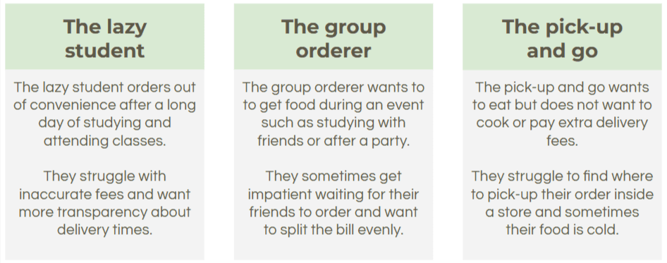
User Types
From our research, we created three user types to summarize who interacts with food delivery apps:

Synthesis
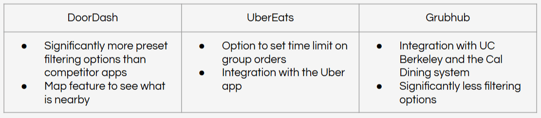
Competitive Analysis
Overall, the three apps were very similar in layout and features. Some unique features include:
Feature Comparison
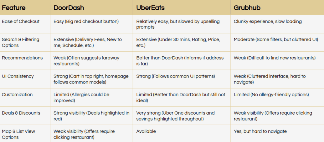
The apps differ the most in how much information is presented to the user. We found this to be notable since users reported wanting additional transparency about costs, delivery times, and ingredients. Differences in features include:
Ideation
Based on our findings, we concluded the top five design issues were:
01) Lack of pricing transparency and hidden fees cause users to feel misled.
02) Inaccurate delivery time estimates demonstrate a lack of communication between user and driver.
03) Cluttered and overwhelming UI filled with excessive recommendations, pop-ups, and redundant categories slow down decision-making.
04) Location-based filtering issues prevent users from finding nearby restaurants, forcing them to sort or search.
05) Limited customization for dietary prevent users from ordering entirely from certain restaurants.
Recommendations
01) Greater transparency
Key features: ingredient and allergy tags, consistent pricing, accurate wait times
By doing so, users can feel more trustworthy toward the app, rather than feeling like they were “cheated” with all the things they did not know prior to purchasing something.
02) Accurate pricing
Key feature: include additional fees as each item is added to cart
Due to the decrease in friction (in needing to constantly go back and forth from the Check-Out page and the cart to compare prices), it can save a lot of time and effort for the users.
03) Better customization of notifications, viewing options, and filtering
Key features: confine order updates to one communication channel, remove invasive pop-ups, prioritize local restaurants
Having more customizable options enhances user agency and allows them to find information and restaurants efficiently.
We determined an improved food delivery app would consist of all benefits of the competitor apps while addressing the pain points we uncovered. Our recommendations are as follows:
Reflection
01) Transparency
Our research emphasized the value of transparency with users. Features that infringed on user agency and knowledge caused frustration and occasionally caused users to leave an app.
02) User loyalty
All three apps we analyzed used a similar model, but users tend to exclusively use one. This loyalty was often built due to a poor experience with a competitor app, demonstrating the value in producing consistent, positive experiences.
03) Mental models
Because all three apps used similar layouts, users are able to transition between apps easily. Improving the design of any of these food delivery apps should iterate on this model.