Introduction
iMessage Filters
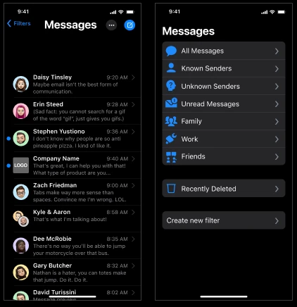
The iMessage filtering system allows users to personally organize their contacts and messages for a less cluttered, overwhelming experience.
Timeline
4 months
Tools
Figma
Google Forms
Team
Pearl Sphao — Research
Govind Nainani — Research
Deliverable
Presentation
High-fidelity prototype
Live demo
Overiew
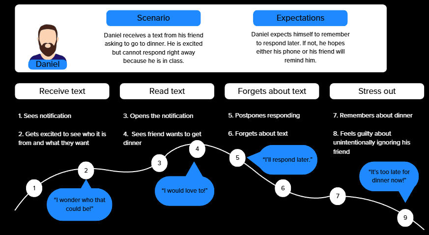
The Challenge
Design Process
iMessage can feel unorganized and cluttered. It is easy for texts to be ignored throughout the day as a result of its design. We aimed to address feelings of being overwhelmed in iMessage.
Empathize
Define
Ideate
Prototype
Test
Research
Interview and Survey Findings
iMessage can feel unorganized and cluttered. It is easy for texts to be ignored throughout the day as a result of its design. We aimed to address feelings of being overwhelmed in iMessage.
01) Clutter
Users reported iMessage looked cluttered when there are unread messages, especially from group chats. The clutter prompted feelings of being overwhelmed and discouraged users from responding.
02) Social Pressure
Users feel a sense of social pressure to respond within a certain time frame and with an appropriate response. This pressure leads users to prolong their response times or not respond altogether.
03) Hierarchies
Users frequently use existing methods of creating organization (ex. pinning contacts) to combat feelings of being overwhelmed. However, the existing system is limited and rigid.
Ideation
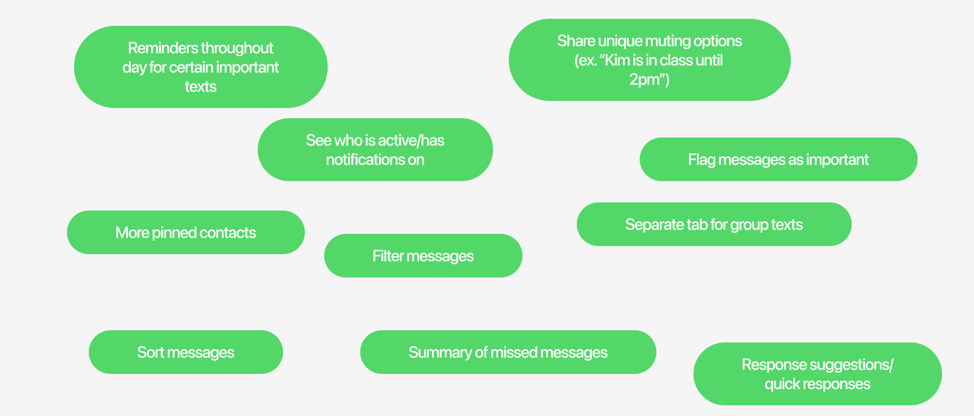
Brainwriting
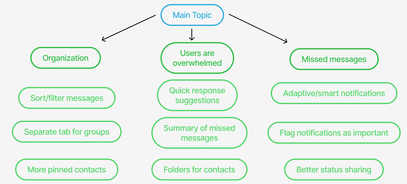
Mind Map
How Might We Statement
How might we redesign iMessage to create a more streamlined experience for users?
Personalized organization systems within iMessage ensure a more streamlined, efficient experience for users. Users have the freedom to customize filtering methods based on their preferences and needs to diminish feelings of being overwhelmed.
Users
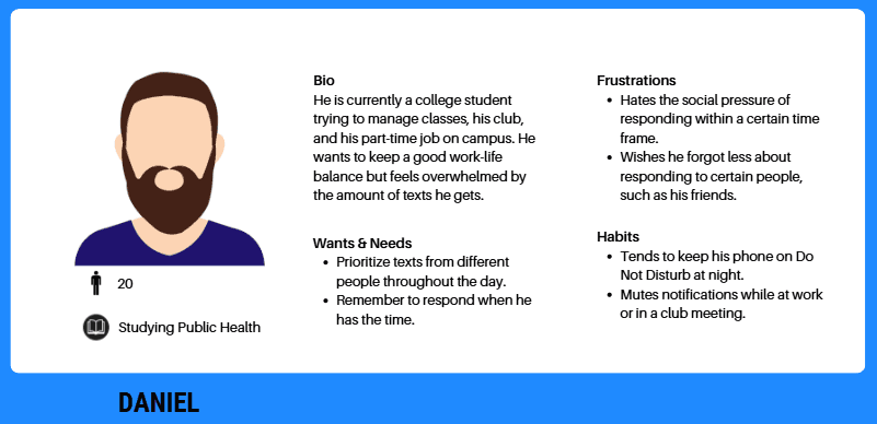
Persona
Journey Map
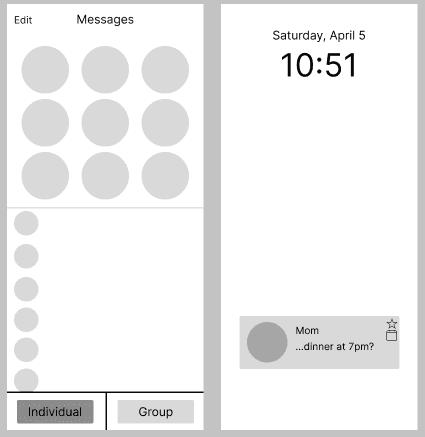
Lo-fi prototyping
This prototype experimented with individual and group filters, as well as organization features on notifications.
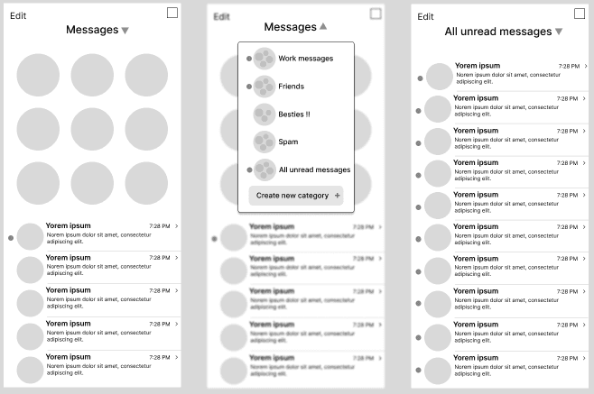
Mid-fi prototyping
I decided to more closely focus on the filtering system itself, allowing for more options and customizability.
Usability Testing
Key Insights
01) Navigation
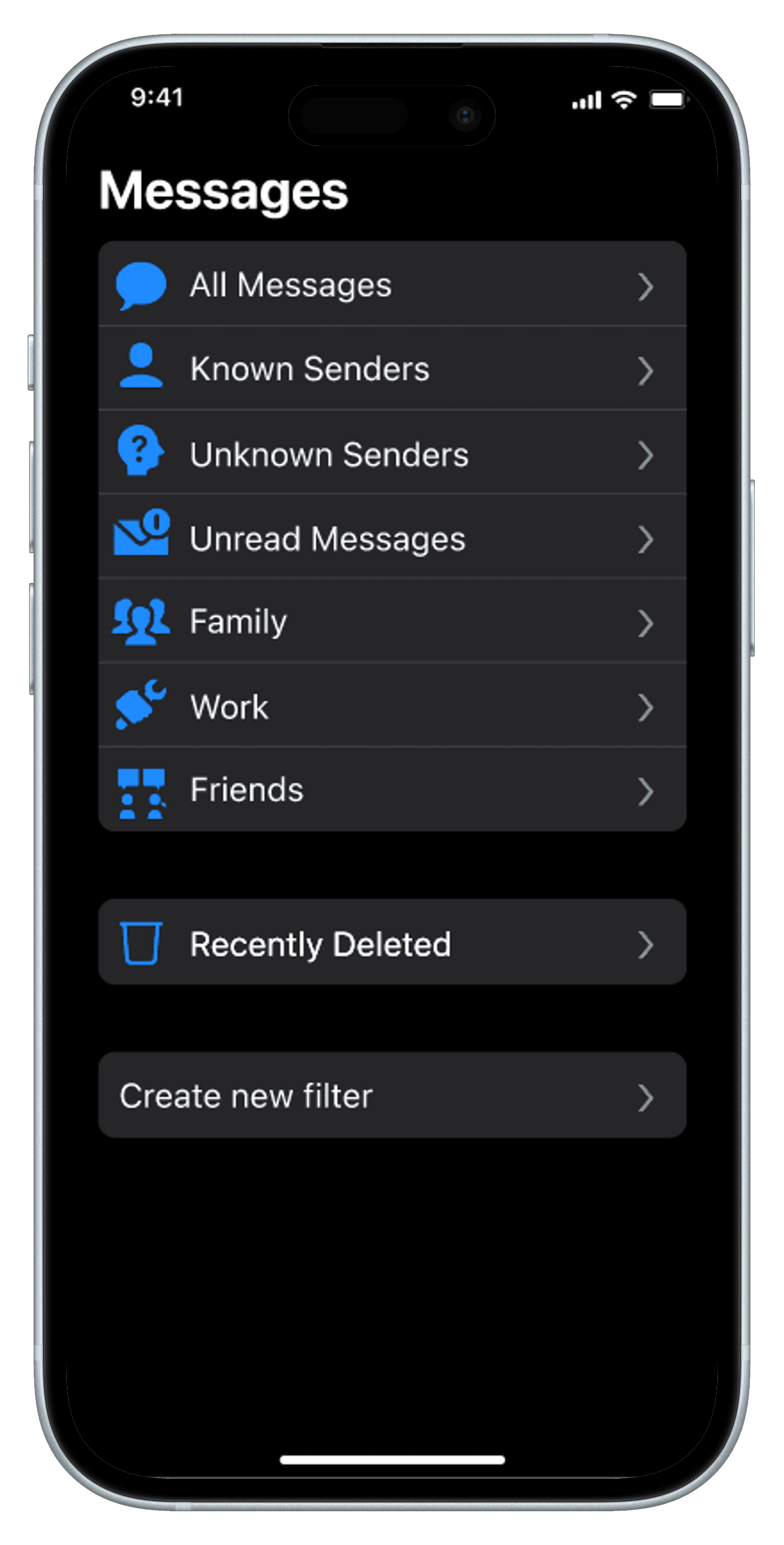
Users disliked the center dropdown, as it felt too disruptive. The final prototype builds upon the already existing Edit page, conforming to users' mental models.
02) Useability
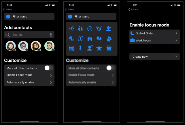
Users wanted more incentive to use the filters. In the final version, integration with existing Focus modes and timers encourages more usage.
03) Existing filter system
Users pointed out the pre-existing spam filter system, which was used to guide design decisions in the final prototype. The final prototype expanded the filter system to enhance customizability.
Updated mid-fi prototyping
Based on feedback, I pivoted to update and expand the existing filter system. I increased personalization for a more flexible experience.
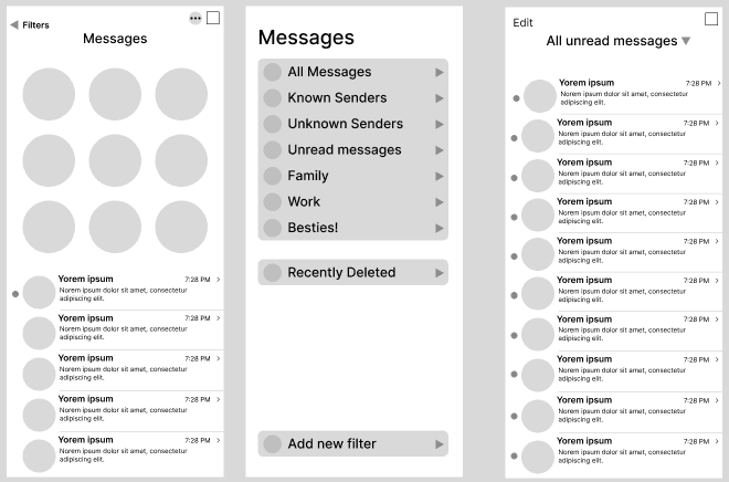
High-fi prototyping
Accessing the filter screen.
Creating and customizing filters.
Reflection
01) Understanding scope
Pivoting to focus solely on the filtering system allowed for greater customization and polish. It is valuable to consolidate ideas when time is limited, and the iterative design process allows for this evolution.
02) Using existing systems
Additional research at the beginning of the project could have directed me to the already existing spam filter system. I learned the value in this initial step, as it could have helped focus my ideas.
03) Gathering Feedback
Throughout the project, I had the opportunity to get weekly feedback and give a mid-point presentation. These steps were critical in solidifying my research and gaining new perspectives.